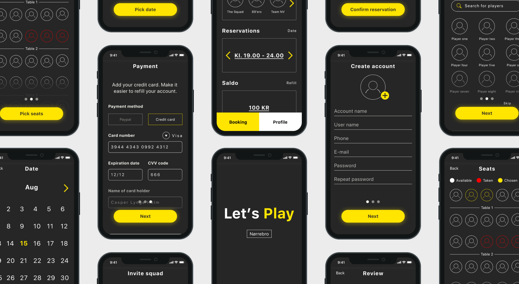
Relic from the 90’s

Design an app concept
Project Overview
A shared interest and understanding of the pain points sparked the idea for this project.

This made it easy to form a hypothesis after exploring the problem space collectively validating the needs via desk research, a survey and interviews. Then having a workshop to generate ideas to shape the concept and how the app might be structured.

The most interesting findings was that user find attending an Internet cafe a highly social activity different from gaming from your home, which became the defining reference for designing the concept.
Problem statement
How might we improve the user experience of an Internet cafe via an app?
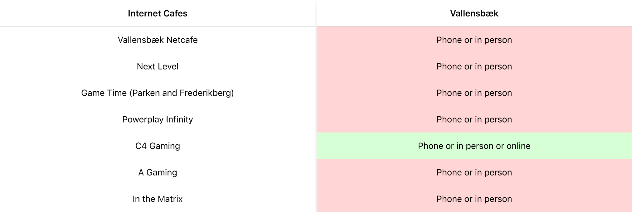
Desk research was carried out to examine if the assumptions were true.   As can be seen in the table below only one in seven cafés offered another reservation opportunity than telephone or being there in person. This confirmed the lack and possible need for interactive reservation opportunities.
Research
Desk research
Questionnaire
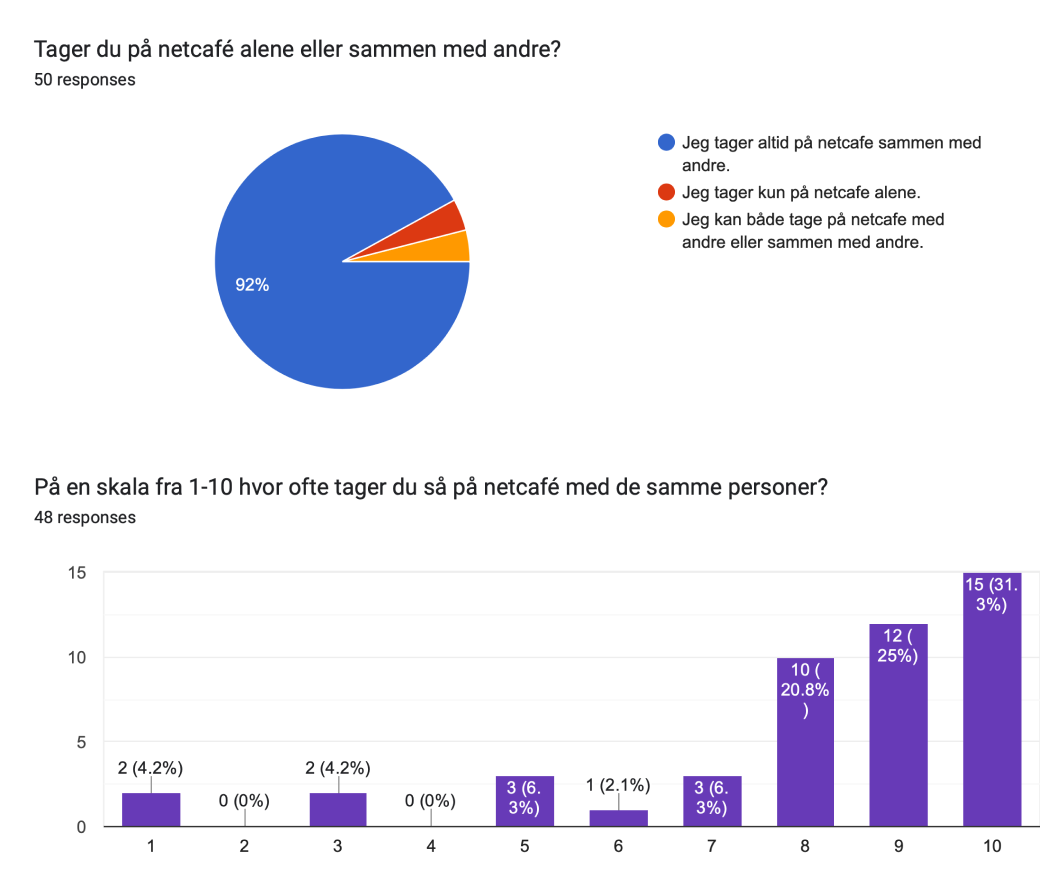
A survey was created to gain general insights into the demography, use of and attitudes towards Internet cafes and how they plan their visits.

The results revealed that trips to internet cafés are a highly social activity, which is often done with the same people at a favourite internet café. A contradicting notions is that they don’t seem to have or see the benefits in memberships at their preferred places.

Two main themes were were the problems frequently mentioned across the interviews - reservation and membership.

1. The most important thing for our participants was that they would be able to sit next to each other to have a proper social experience.

"The worst would be to show up at the internet café, and there is no availability".

2. Memberships are a matter that the users do not see the advantage of
Interviews
Workshop
Group discussion
Card sorting
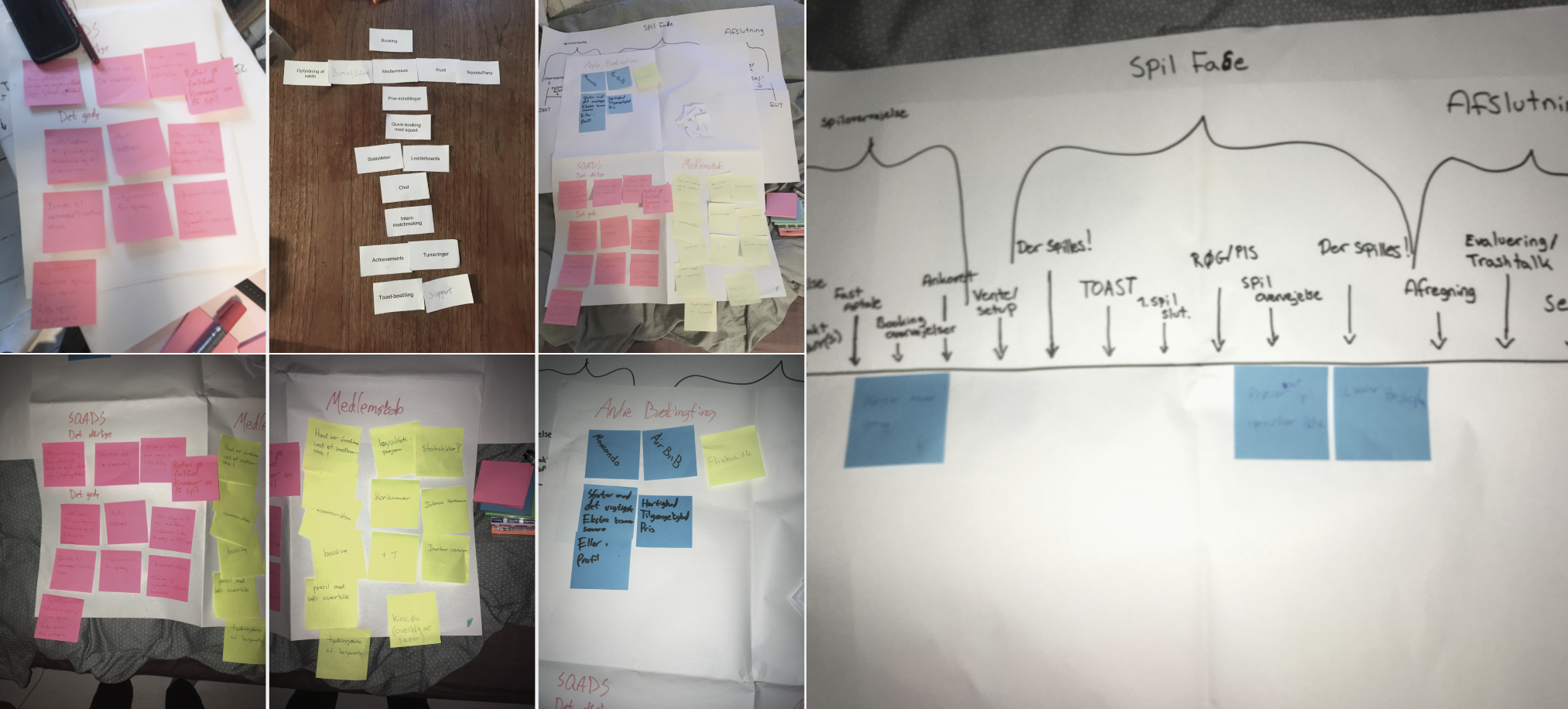
The workshop were carried out with five males in the age group 23-27 who regularly attend internet cafés.

First the pain points were refreshed and placed in a journey map. Then it turned into group discussion of "how might we" and lastly a shared card sorting exercise for the information hierarchy in the app.

Ideas for features
1. Reservation
2. Quick reservation for squads
3. Tournaments
4. Achievements
5. Refilling account with money
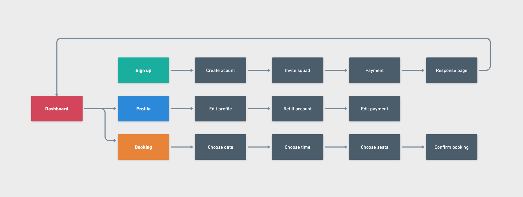
A flowchart was created in Whimsical to get an estimate of what needed to be done
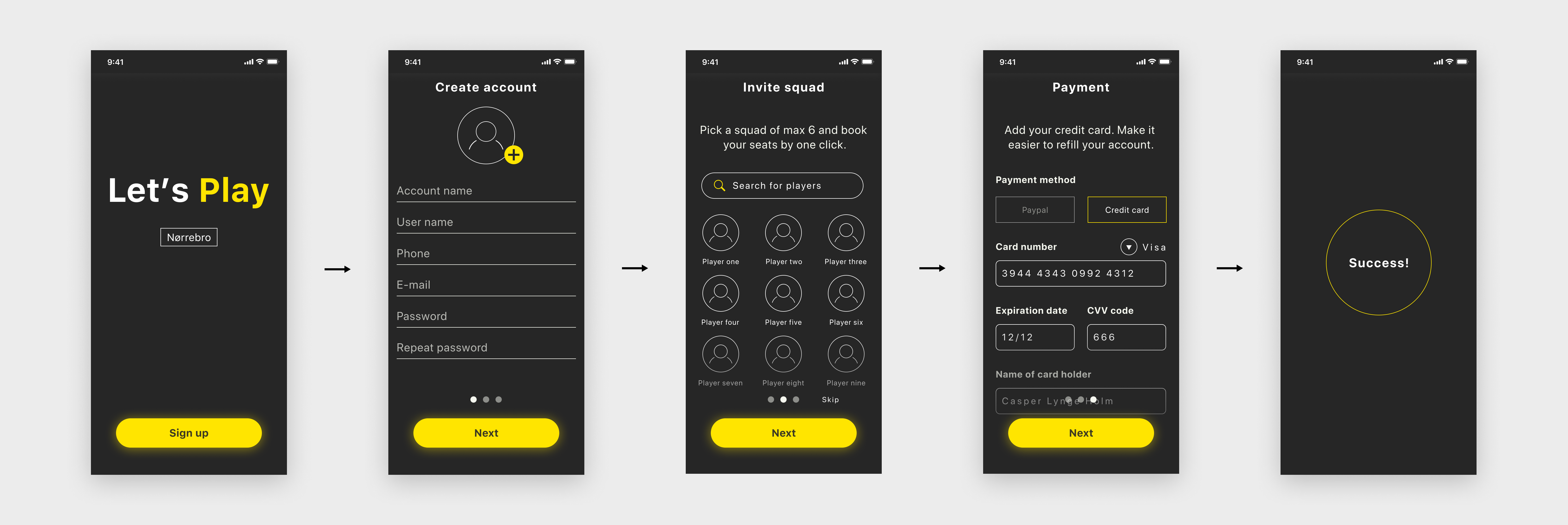
Onboarding is the first interaction with the app and therefore an obvious place to give the users the possibility of inviting their friends to their squad.
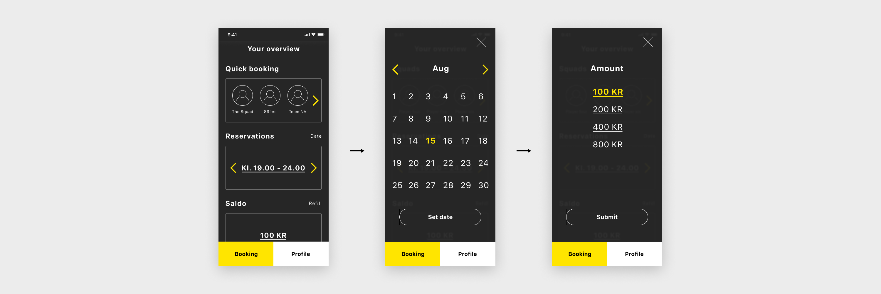
The Dashboard allows you to see you current reservations and to refill the account. Here i have gone a little off Apples guidelines for navigation since the app and its purpose is so narrow, i believe that it makes the usability more seamless. Moreover modals is used to limit elements and simplify what needs to be communicated.
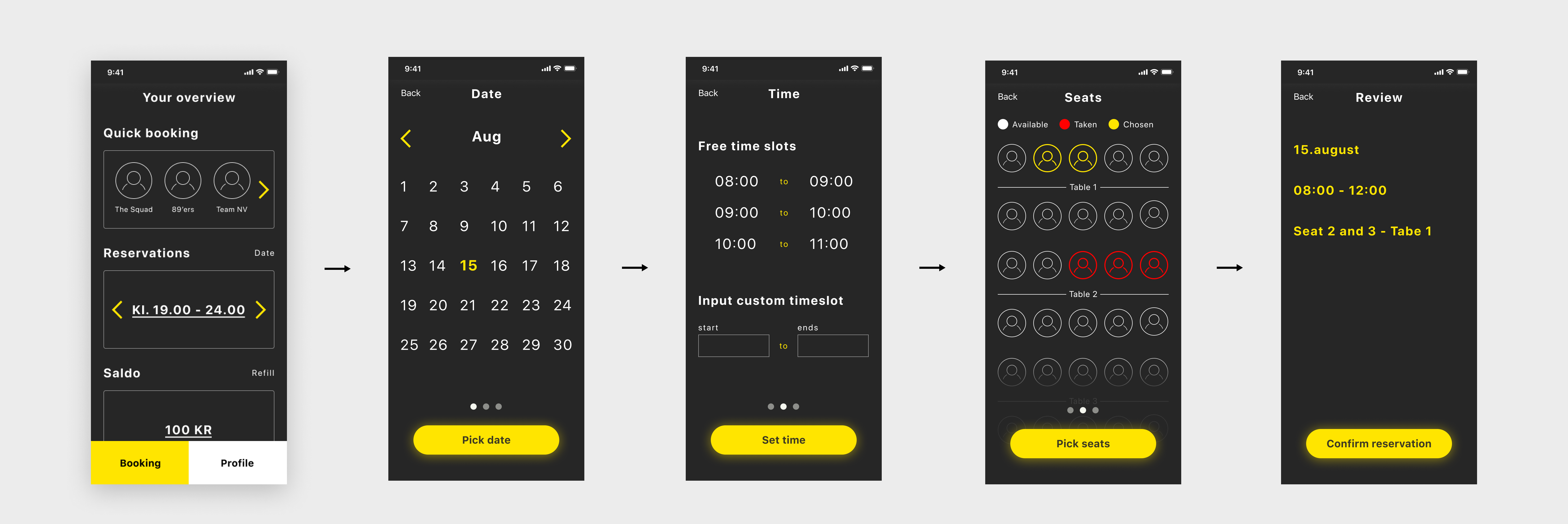
The Booking flow is most essential part of the app where the same principles of simplicity and ease of use has been applied within the limitation of the Iphone.